Inline Map Marker Links
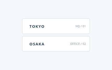
A map pin and distance note open beside a company location link.
A map pin and distance note open beside a company location link.
Live Demo
Hover over the element or use Tab to focus.
Source Code
Copy the HTML, CSS or JavaScript you need for your project.
HTML
<nav class="tbx-1178" aria-label="Office locations"><a href="#tokyo"><span class="tbx-1178__pin" aria-hidden="true">⌖</span><b>TOKYO</b><small>HQ / 01</small></a><a href="#osaka"><span class="tbx-1178__pin" aria-hidden="true">⌖</span><b>OSAKA</b><small>OFFICE / 02</small></a></nav>
CSS
.tbx-1178{box-sizing:border-box;display:flex;flex-direction:column;width:260px;max-width:100%;gap:8px;font-family:system-ui,sans-serif}.tbx-1178 a{display:flex;align-items:center;gap:11px;height:60px;padding:0 14px;text-decoration:none;color:#2a4558;border:1px solid #cadae2;border-radius:5px;background:#fff;overflow:hidden;transition:background .4s,border-color .4s}.tbx-1178__pin{width:25px;height:25px;display:grid;place-items:center;border-radius:50%;background:#e4ecef;color:#52798b;font-size:22px;transform:translateX(-24px) scale(.5);margin-right:-23px;opacity:0;transition:transform .4s,margin .4s,opacity .4s}.tbx-1178 b{font-size:15px;letter-spacing:.1em}.tbx-1178 small{margin-left:auto;font-size:10px;letter-spacing:.06em;color:#7e98a3}.tbx-1178 a:is(:hover,:focus-visible){background:#e8f4f3;border-color:#76b7b1}.tbx-1178 a:is(:hover,:focus-visible) .tbx-1178__pin{transform:translateX(0) scale(1);margin-right:0;opacity:1}.tbx-1178 a:focus-visible{outline:3px solid #167b81;outline-offset:3px}
@media (prefers-reduced-motion: reduce) { .tbx-1178, .tbx-1178 *, .tbx-1178::before, .tbx-1178::after, .tbx-1178 *::before, .tbx-1178 *::after { transition-duration:.01ms !important; animation-duration:.01ms !important; scroll-behavior:auto !important; } }
How to Use
Insert the HTML and add the CSS to your stylesheet. Adjust colors and sizes and avoid class conflicts.
Use Case
Useful for navigation menus and locations sections.
Technical Notes
Keep controls usable on touch devices. Test keyboard focus and reduced-motion preferences.
Mobile: Ensure the interactive content remains accessible without hover on touch devices.
Browser: Uses modern CSS. Check behavior in the browsers you support.
Reduced Motion: Check that prefers-reduced-motion is respected.