Meta Label Turn
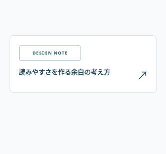
An article-category label turns over to reveal a second piece of publication information.
An article-category label turns over to reveal a second piece of publication information.
Live Demo
Hover over the element or use Tab to focus.
Source Code
Copy the HTML, CSS or JavaScript you need for your project.
HTML
<a class="tbx-1083" href="#article" aria-label="Read the production notes article"><span class="tbx-1083__flip"><span class="tbx-1083__front">DESIGN NOTE</span><span class="tbx-1083__back">2026 / 10</span></span><span class="tbx-1083__title">How whitespace improves readability</span><span class="tbx-1083__arrow" aria-hidden="true">↗</span></a>
CSS
.tbx-1083{width:min(293px,100%);display:grid;grid-template-columns:1fr 20px;gap:13px;background:#fff;padding:19px 18px;border:1px solid #dce3e7;border-radius:8px;color:#294c5c;text-decoration:none;font:12px/1.4 system-ui,sans-serif;transition:box-shadow .3s}
.tbx-1083__flip{grid-column:1;position:relative;display:block;width:123px;height:30px;transform-style:preserve-3d;transition:transform .55s cubic-bezier(.2,.7,.2,1)}
.tbx-1083__front,.tbx-1083__back{position:absolute;inset:0;display:grid;place-items:center;backface-visibility:hidden;border:1px solid #b0c8cd;color:#396a76;letter-spacing:.09em;font-size:9px;font-weight:800;border-radius:3px}
.tbx-1083__back{transform:rotateY(180deg);background:#416e7b;color:#fff;border-color:#416e7b}
.tbx-1083__title{grid-column:1;grid-row:2;font-size:13px;font-weight:750}.tbx-1083__arrow{grid-column:2;grid-row:2;font-size:22px;align-self:end;transition:transform .35s}
.tbx-1083:is(:hover,:focus-visible){box-shadow:0 12px 26px #2a536a17}.tbx-1083:is(:hover,:focus-visible) .tbx-1083__flip{transform:rotateY(180deg)}.tbx-1083:is(:hover,:focus-visible) .tbx-1083__arrow{transform:translate(3px,-3px)}
.tbx-1083:focus-visible{outline:3px solid #ceaf79;outline-offset:3px}
@media(prefers-reduced-motion:reduce){.tbx-1083,.tbx-1083 *{transition:none!important}.tbx-1083:is(:hover,:focus-visible) .tbx-1083__flip{transform:none}.tbx-1083:is(:hover,:focus-visible) .tbx-1083__front{opacity:0}.tbx-1083:is(:hover,:focus-visible) .tbx-1083__back{transform:none;opacity:1}}
How to Use
Insert the HTML and add the CSS to your stylesheet. Adjust colors and sizes and avoid class conflicts.
Use Case
Useful for articles and blogs and editorial layouts.
Technical Notes
Keep controls usable on touch devices. Test keyboard focus and reduced-motion preferences.
Mobile: Ensure the interactive content remains accessible without hover on touch devices.
Browser: Uses modern CSS. Check behavior in the browsers you support.
Reduced Motion: Check that prefers-reduced-motion is respected.