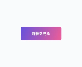
Gradient Flow
A soft gradient shifts within the interactive surface.
A soft gradient shifts within the interactive surface.
Live Demo
Hover over the element or press Tab to focus.
Source Code
Copy the HTML, CSS or JavaScript you need for your project.
HTML
<button type="button" class="tb-tip tb-tip--gradient">View details</button>CSS
/* このサンプル共通のボタン基本形(単体利用可) */
.tb-tip {
  appearance: none;
  box-sizing: border-box;
  display: inline-flex;
  align-items: center;
  justify-content: center;
  gap: .55em;
  min-width: 156px;
  min-height: 52px;
  padding: 13px 21px;
  position: relative;
  border: 1px solid #c8d2e2;
  border-radius: 7px;
  background: #fff;
  color: #15233b;
  font: 650 14px/1.35 system-ui, sans-serif;
  text-decoration: none;
  cursor: pointer;
  isolation: isolate;
  -webkit-tap-highlight-color: transparent;
}
.tb-tip:focus-visible {
  outline: 3px solid #7864ed;
  outline-offset: 4px;
}

.tb-tip--gradient {
  color: #fff;
  border-color: transparent;
  background: linear-gradient(110deg, #6652dc, #f15e95, #6652dc);
  background-size: 220% 100%;
  background-position: 0% 50%;
  transition: background-position .48s ease, transform .24s ease;
}
.tb-tip--gradient:is(:hover, :focus-visible, .is-active) {
  background-position: 100% 50%;
  transform: translateY(-2px);
}

@media (prefers-reduced-motion: reduce) {
  .tb-tip, .tb-tip::before, .tb-tip::after,
  .tb-tip > span { transition-duration: .01ms !important;
    animation-duration: .01ms !important; }
}
How to Use
Insert the HTML and add the CSS to your stylesheet. Adjust colors and sizes and avoid class conflicts.
Use Case
Campaign and promotional links.
Technical Notes
Keep controls usable on touch devices. Test keyboard focus and reduced-motion preferences.
Mobile: Verify focus and tap behavior on touch devices.
Browser: Uses modern CSS features.
Reduced Motion: Respects prefers-reduced-motion.